Case study
Giving digital voice to a rare expertise bridging Japan and Europe
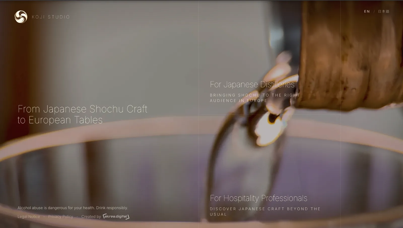
A brand identity and a bilingual English–Japanese website for an advisory practice devoted to the world of shochu, where Japanese craft meets European markets.
Client
Koji Studio
Sector
Advisory practice around Japanese shochu
Markets
Japan and Europe
Scope
Strategy, brand, logo, design, development, SEO
Context
A finely tuned expertise built over years between Japan and Europe, yet without a digital presence to carry it. Everything had to be shaped from the ground up: the brand, the narrative, the visual identity and a website able to embody this positioning with the restraint it deserves.
- Brand to design from scratch
- A demanding, discreet world
- Two cultures to bridge
- Bilingual site to design
Challenges
Positioning
Establishing a distinctive voice where Japanese craft meets European sensibilities.
Identity
Designing a logo and palette that feel quiet, contemporary and true to the subject.
Message
Striking the right balance between precision, restraint and clarity, in both English and Japanese.
Performance
Delivering a fast, refined and readable site that reinforces how the brand is perceived.
Strategy and brand creation
Brand platform
Upstream work on mission, tone of voice and narrative to bring out a precise voice rooted in two cultures.
Logo and visual identity
A refined logo, a carefully balanced colour palette and a type system designed to work in both English and Japanese.
Editorial voice
A short, evocative and precise narrative that carries the same weight in English and in Japanese.
Editorial architecture
A page flow that guides naturally toward getting in touch, without ever pushing.
Design and development
Art direction
Cinematic art direction rooted in a contemporary Japanese aesthetic.
Bilingual website
An English and Japanese build with typography tuned to each writing system.
Performance
A lightweight site, near-instant loading and a mobile-first experience.
SEO foundations
Clean semantic structure and considered metadata to lay the ground for organic visibility.
Outcome
A coherent brand, a distinctive identity and a fast bilingual website — together they match the finesse of the expertise they represent.
Brand built from the ground up
Bespoke logo and palette
Fast English and Japanese site
Clear, distinctive narrative